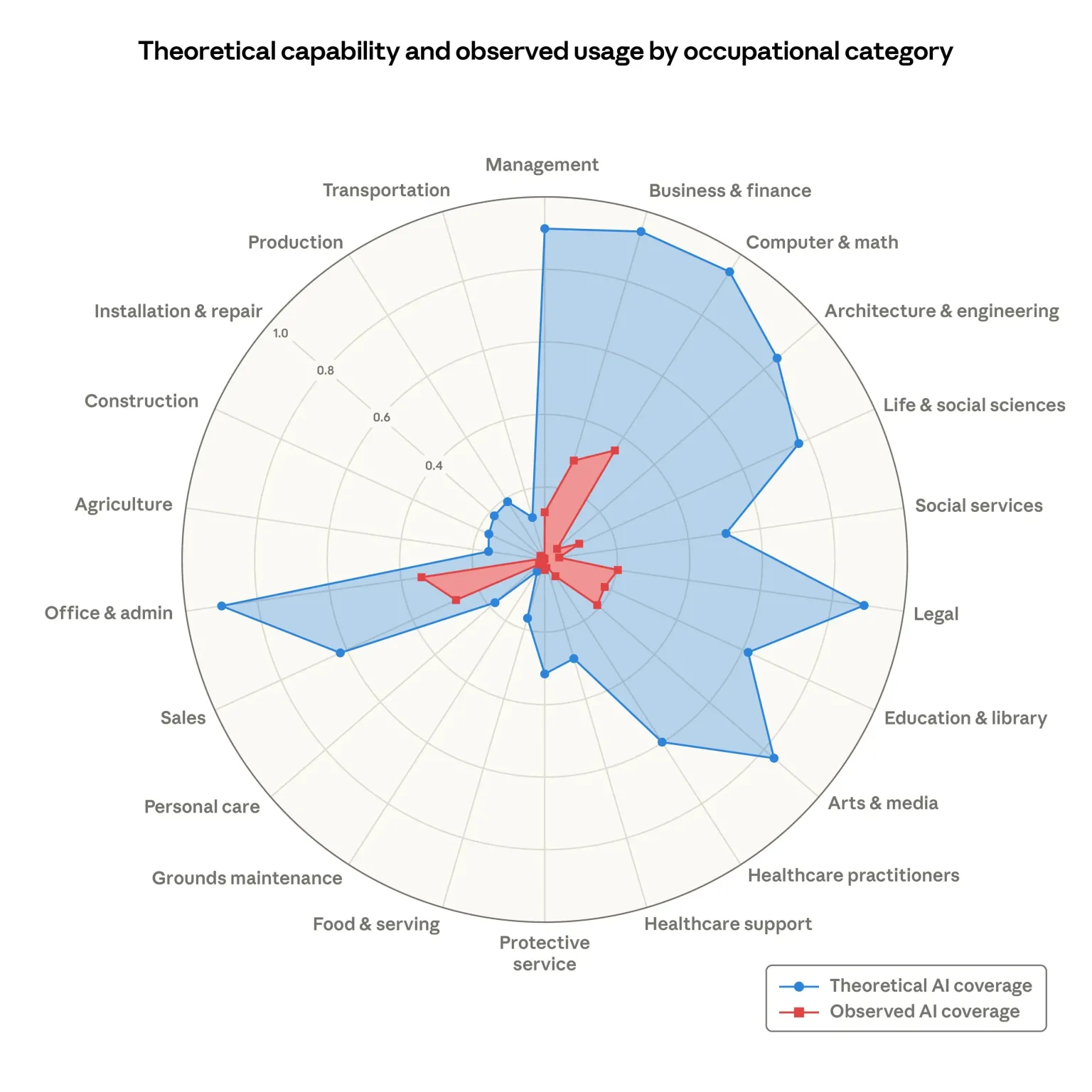
A chart has been circulating everywhere for days. A radar. A huge blue area covering almost the entire disc, and at the center, a small red splash, tiny, almost shy. The blue is what artificial intelligence could theoretically do with your job. The red is what it actually does today.
The visual message is immediate, visceral, unstoppable: look at all that empty space. Look at everything left to conquer.
The chart comes from a report published by Anthropic, titled “Labor market impacts of AI: A new measure and early evidence” (Anthropic). The report is serious, methodologically honest, and remarkably humble about its own limits. The chart, however, lives an independent life. It has become a viral object, decontextualized, shared by thousands of people who never opened the paper.
Here is what bothers me: a company that sells artificial intelligence published, on its own website, a measure of how much of the economy its own product could cover, based on its own usage data. However rigorous the method, this document is structurally also a marketing object.
A chart designed to be shared
Look at the shape. A radar with twenty-one occupational categories. A vast blue surface spilling toward Management, Business & finance, Computer & math, Legal, Office & admin. A red surface clustered at the center, barely reaching 0.33 on its best axis.
That composition tells a story in half a second, with no text, no nuance, no method. It works exactly the way good advertising works: it installs a conclusion before the analytical brain has had time to wake up.
Anthropic offers its own explicit reading: as capabilities advance and adoption spreads, the red area will grow to cover the blue. Blue becomes the future tense of red. No conditional, no hypothesis. A trajectory.
Alberto Romero, writing in The Algorithmic Bridge, offers the symmetrical interpretation, equally defensible: the gap between blue and red can be read as a diagnosis of AI’s limits, not as a growth promise. Look at how much bigger the blue still is (The Algorithmic Bridge).
Same chart. Two opposing narratives. Only one of them is printed into the image.
What the blue actually measures
This is where it gets interesting, and Valdis Gavars did the work almost nobody did: he read the paper and traced the blue back to its source (Valdis Gavars).
The blue does not come from Anthropic. It comes from a 2023 study by OpenAI researchers, Eloundou et al., “GPTs are GPTs” (arXiv). Their definition of exposure: would a human with LLM access complete this task in half the time?
Three details change everything.
First detail: the original score was graded. 1 if an LLM alone can double execution speed, 0.5 if it requires additional tools or software built on top, 0 otherwise. Anthropic collapsed that gradation. In its appendix, any score above zero becomes 1. In other words, a task requiring software that does not yet exist counts exactly like a task a model already handles alone. The blue is inflated by construction.
Second detail: the reference model. Annotators were told to imagine the most powerful LLM available at labeling time, with a 2,000-word input limit and no access to recent facts. We are talking about the GPT-3.5 family. The blue you are sharing in 2026 describes a capability imagined in 2023.
Third detail: nobody tested anything. No task was executed by a model to verify. Human annotators and GPT-4 read task descriptions from the U.S. Department of Labor’s ONET database and made a judgment call (ONET OnLine). The authors themselves acknowledge the subjectivity of labeling, and that their annotators are not occupationally diverse, which may bias their judgment about jobs they barely know.
The blue is therefore an opinion, formed in 2023, about an obsolete model, with a generous rounding rule, concerning jobs the raters do not practice.
What the red actually measures
The red is Anthropic’s own contribution, drawn from Claude.ai conversations and API traffic in professional settings, via the Anthropic Economic Index (Anthropic Economic Index).
Two remarks.
The red does not measure AI usage. It measures Claude usage. An executive looking at this chart believes they are seeing a photograph of the market. They are seeing one vendor’s market share, on a user base that is in no way representative of the working population.
And the red is weighted. Per the appendix, purely augmentative use counts 0.5, purely automated use counts 1. The red is pulled toward production automation, not toward the person asking a question at their desk. Two surfaces, two counting rules.
The finding nobody quotes
Here is the tastiest part. The report itself announces, in its opening line, that it finds limited evidence that AI has affected employment to date.
On unemployment: the unemployment rate of the more exposed group increased slightly, but the effect is indistinguishable from zero. Tested at every threshold, from the median to the 95th percentile, the impact is flat or negative. Cross-checking with Department of Labor unemployment insurance data yields 0.1 percentage point, insignificant.
The only signal: a 14% drop in the hiring rate for workers aged 22-25 into exposed occupations. The authors themselves call it just barely statistically significant, with several alternative interpretations.
The report even recalls, in its introduction, that a prominent attempt to measure job offshorability identified roughly a quarter of US jobs as vulnerable, and a decade later most of those jobs showed healthy employment growth.
So: the paper says “we measure no effect.” The chart says “everything will be covered.” Guess which of the two went around LinkedIn.
When the party producing the measure sells the product being measured
There is an abundant literature on this phenomenon, and it does not come from tech. It comes from medicine. Cochrane synthesized decades of work on the effect of industry funding: industry-sponsored studies more often produce results favorable to the sponsor, and more often favorable conclusions, with risk ratios around 1.27 and 1.34 (Cochrane).
The crucial point of that literature: this bias is not explained by standard methodological quality assessments. It does not live in a calculation error. It lives in the choice of the question asked, in the framing, in what gets highlighted, in the figure placed on page two.
Nobody needs to lie. It is enough to choose which truth to render visual.
That is exactly what I discuss in my book, in chapter 10 devoted to the communication, presentations and decision-making pillar. An effective presentation does not add false numbers. It arranges the true ones in an order that produces a conclusion. Anthropic’s chart is a textbook case of storytelling applied to data: one image, two colors, one asymmetry, and a narrative that installs itself.
Why it works so well on us
Because we are wired to fall for it.
Authority bias first: the document comes from a leading AI lab, with appendices, equations, references. The academic form disarms vigilance.
Confirmation bias next: if you are already convinced AI will transform everything, the blue proves you right. If you are already worried about your job, the blue terrifies you. Either way, you share it.
Social conformity last: when three hundred people in your network have shared the chart within twenty-four hours, the social cost of asking “by the way, what does the blue actually measure?” becomes high.
I devote a significant part of chapter 6 of my book to these cognitive biases, because they are the first obstacle to innovation. An executive building an AI strategy on a viral chart is making an investment decision based on an opinion issued in 2023 about GPT-3.5. The mechanism is the same one that makes companies buy a solution because a competitor bought it.
What this concretely changes for an executive
The chart suggests a simple plan: blue is the target, the gap must be closed, therefore deploy massively.
Field numbers tell another story. The MIT report on the state of AI in business estimated that 95% of generative AI pilot projects produce no measurable impact on the P&L, and the identified cause is not model quality but the organizational learning gap (Fortune).
The gap between blue and red is therefore not a space to be conquered by compute. It is a space occupied by processes, habits, fears, procurement rules, confidentiality questions, and employees wondering first whether their job will still exist next year.
In my book, in chapter 14 devoted to applying the innovational intelligence® system to artificial intelligence, I describe the exact order of operations: decide whether AI influences your vision, communicate before deploying, build a multidisciplinary exploration team, and only then deploy. The La Poste case in January 2024, with an AI strategy defined in July 2023 and postal workers presented with a fait accompli six months later, illustrates what happens when that order is reversed. A strike, not an adoption curve.
No radar chart will close that gap for you.
How to read the next chart before sharing it
Three questions, thirty seconds, and you will avoid relaying an advertisement while believing you are relaying a measurement.
Who produces the data, and what does that party sell? This disqualifies nothing, it calibrates the reading.
What does each color measure exactly, and are both colors measured with the same rule? Here, no. A human judgment from 2023 against usage logs from 2026, with different weightings.
What does the text say that the figure does not? Here, the text says no employment effect is detected. The figure says the opposite.
Anthropic’s report deserves to be read. It is transparent about its method, careful in its conclusions, and useful as a measurement framework. The chart extracted from it deserves to be treated for what it has become: a company’s communication material about its own potential market.
Read the paper, not the chart.



References
- (Anthropic) https://www.anthropic.com/research/labor-market-impacts?utm_source=philippeboulanger.com
- (Anthropic Economic Index) https://www.anthropic.com/economic-index?utm_source=philippeboulanger.com
- (arXiv) https://arxiv.org/abs/2303.10130?utm_source=philippeboulanger.com
- (O*NET OnLine) https://www.onetonline.org/?utm_source=philippeboulanger.com
- (The Algorithmic Bridge) https://www.thealgorithmicbridge.com/p/anthropics-new-ai-report-accidentally?utm_source=philippeboulanger.com
- (Valdis Gavars) https://gavars.dev/blog/everyone-sharing-the-chart/?utm_source=philippeboulanger.com
- (Cochrane) https://www.cochrane.org/evidence/MR000033_industry-sponsorship-and-research-outcome?utm_source=philippeboulanger.com
- (Fortune) https://fortune.com/2025/08/18/mit-report-95-percent-generative-ai-pilots-at-companies-failing-cfo/?utm_source=philippeboulanger.com